On a bright Friday in Dubai, morning light slipped past towers and fell across a living room painted in warm greige. Amal stood by the window with tea and a fan of fabric swatches, wondering if her new drapes should echo the paint or stand apart. She wanted calm, she wanted order, and she wanted the home to feel put together without turning stiff. That simple question, whether Matching curtains with wall color is the right move, has followed homeowners from JLT studios to Meydan villas for years. Today we will answer it with quiet clarity, local detail, and a handful of stories from UAE rooms where color became a steady friend instead of a risk.
Why Matching Curtains with Wall Color Can Elevate Your Interiors
When your curtains and walls speak the same language, the eye rests. The room feels composed, not busy. In UAE homes, windows often drop 260 to 300 cm from ceiling to floor, which means your drapes occupy a huge slice of the visual field. Matching can be a shortcut to serenity if you do it thoughtfully. The goal is not sameness, the goal is harmony, and harmony is where the room breathes easily even after a long workday in Business Bay or a hot drive back from Abu Dhabi.
Cohesion & Simplicity for Elegant Curtain Color Combinations
Color cohesion trims visual noise. If your living room walls are a warm beige, selecting curtains one or two tones deeper in the same family brings structure without showiness. In the center of this idea, elegant curtain color combinations happen when tone, undertone, and fabric texture agree. You can still layer interest through weave, pleat style, and hardware. The color does the quiet work so the room can relax.
Harmonized Effect Across the Room
A harmonized scheme lets other elements stand out. When curtains match or closely echo the wall color, your oak media wall, woven rug, or black steel lamp becomes the star. In the center of this effect, choosing curtains for wall color is a way to organize attention, not to mute the room. The eye moves calmly from paint to fabric, then rests on the things you love.
Create an Open & Spacious Feel
Light, similar tones widen small spaces. In compact apartments in JVC or Al Nahda, ceiling mounted tracks with drapes close to wall color give the sense of taller walls and broader windows. Keep hems at kiss length, roughly 5 to 10 mm above the highest point of the floor, so the line stays crisp. In the center of small room planning, how to match curtains with walls often starts with a simple rule, stay within one or two tones of the paint and let height do the rest.
Highlight Other Interior Elements with the Right Curtains
When curtains do not shout, furniture can. A caramel leather sofa against mushroom walls looks richer when drapes echo the paint. Your art reads sharper when the background softens. The trick is contrast control. In the center of this balance, curtain color ideas for interiors that match walls allow texture changes to carry personality, linen look weaves, subtle stripes, or a quiet herringbone.
Works Ideally with Neutral Wall Shades
Matching shines with neutrals, greige, stone, oat, warm white, pale taupe. In villas across Arabian Ranches or Yas Island, these paints are common because they tolerate sunlight and dust. Close matches feel composed all year. Right in the middle of this reality, Matching curtains with wall color thrives when the paint is neutral and the fabric brings the texture that makes the look complete.
Cons of Matching Curtains with Wall Color You Should Know
Risk of a Dull Appearance
Too perfect can feel flat. If wall and drape match exactly, especially in matte finishes, the window can vanish in a way that feels lifeless. Solve it with texture. Choose a slubbed weave, a soft sheen, or a linen look. Add a gentle contrast through tiebacks or a pale pelmet. In the center of this caution, curtain color ideas for interiors succeed when they factor in texture as much as shade.
Not Suitable for Every Design Style
Bold modern spaces that rely on contrast, black frames with white walls, street art prints, glossy floors, often want a step away from perfect matches. A charcoal or black drape against light gray paint might carry the mood better. In homes with rustic or bohemian energy, the curtain may reference a rug or artwork rather than the wall. The point sits in the center of taste, and it explains why choosing curtains for wall color is not the only path to a stylish result.
Limits Your Choice of Curtain Color Ideas for Interiors
Matching narrows the palette. If you love seasonal updates, contrast drapes give you more play. You can still match walls and add color through cushions, but if fabric color is your favorite tool, a close match may feel limiting. In the middle of this tradeoff, remember that how to match curtains with walls is simply one method among many.
Essential Tips for Choosing Curtains That Match Wall Color
Consider the Wall Color Before Choosing Curtains
Start with undertone. A warm wall leans yellow, red, or brown. A cool wall leans blue or green. Keep the drape in the same family unless you want deliberate tension. Hold A4 fabric swatches against the wall near the window and at the room center. Test at 10:00, 14:00, and 20:00. In the center of this process, how to match curtains with walls becomes simple pattern recognition, the swatch that looks right all day is your answer.
Factor in Your Space’s Mood
Bedrooms want rest, lounges want conversation, studies ask for focus. A perfect match reads calm in most cases. If you prefer drama at night, pick one or two tones deeper than the wall. If you want morning freshness, pick one or two tones lighter. In the center of mood planning, Matching curtains with wall color is a dial, not an on off switch.
Assess Natural and Artificial Lighting
UAE light is strong, especially on south and west glass after 14:00. Light curtains reflect heat, dark curtains cocoon the evening. For city views with signage, a deeper night layer reduces glow. Check your warm white lamps against the swatch at night, because warm LEDs can push beige toward yellow or gray toward brown. Right where light decides the mood, choosing curtains for wall color asks you to test more than once.
Choose the Curtain Fabric Carefully
Texture saves matches from monotony. A linen look in stone feels richer than flat gray. A heathered greige speaks softly with greige walls. For maintenance in our climate, polyester blends hold color, cotton and linen blends breathe, velvet deepens sound and light control. In the center of practical living, best window curtains in Dubai are those that drape well, clean easily, and keep their color in strong sun.
Select Patterns Wisely for Elegant Interiors
Patterns play well when they whisper. Vertical pinstripes add height without noise. Tiny herringbone weaves read like texture from across the room. If you love bolder patterns, keep the palette tight so the match still feels gentle. In the center of balance, elegant curtain color combinations allow pattern as long as contrast stays measured.
Get Sample Swatches Before Final Decision
Always bring fabric home. Ask for A4 samples for sheers, bigger if possible. Photograph at different hours. Pin one swatch beside the sofa and one by the window. Label the backs with brand, code, and AED price per meter. This is the habit that turns Matching curtains with wall color from a guess to a sure step.
Room Stories From UAE Homes
A Meydan Living Room That Needed Calm
Walls in warm greige, floors in soft beige porcelain. The owners picked curtains one tone deeper than the paint, a linen look greige with pearl sheers behind. The result was a room that looked larger and rested. The shelving and art finally took center stage because the window stopped competing.
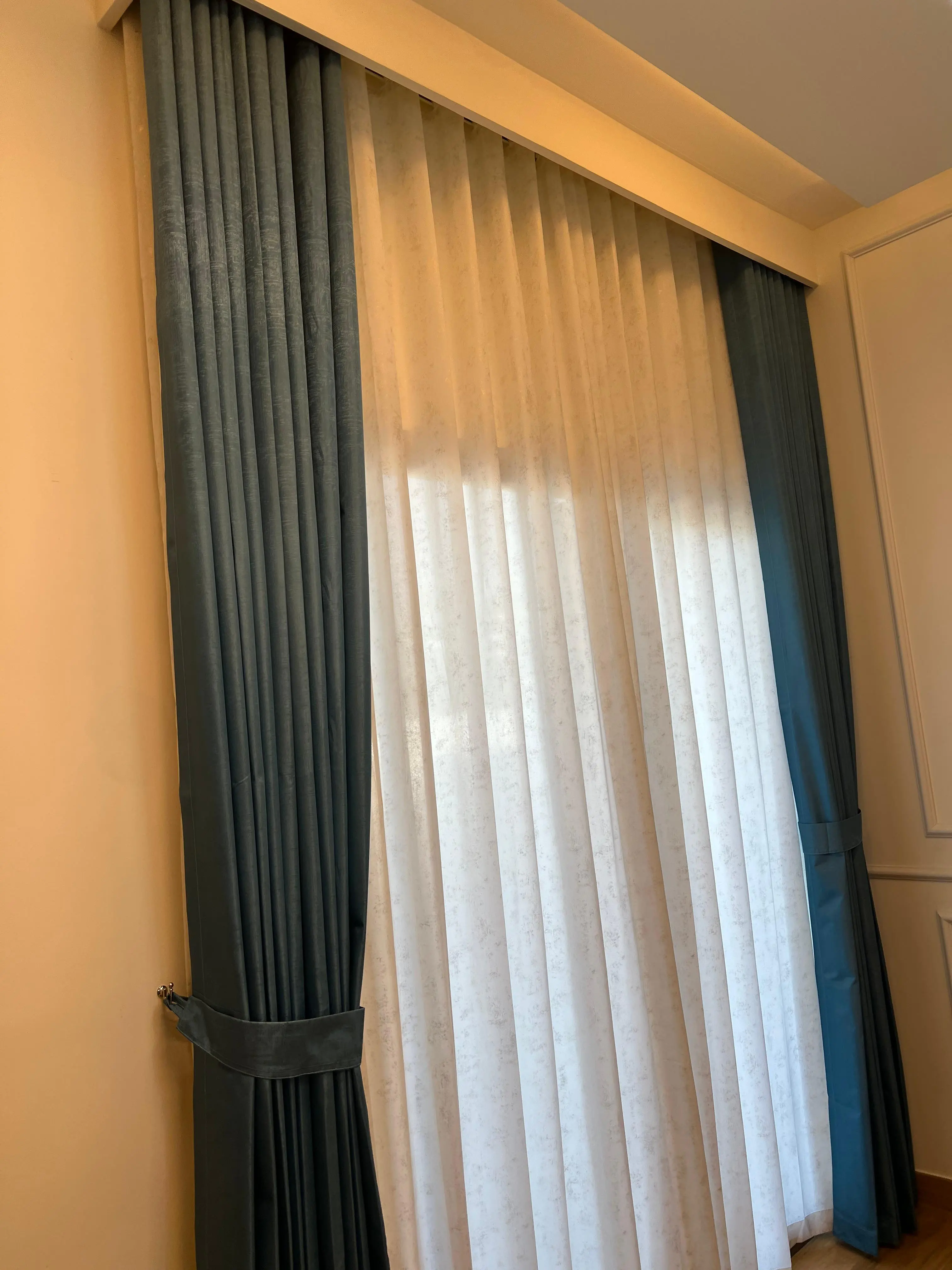
A Dubai Marina Bedroom Near Bright Street Lights
Cool gray walls met charcoal dim out curtains with a silver sheer. The close family of color kept the look composed, while the deeper night layer stopped the midnight glow. Sleep improved from day one, and the city looked like a postcard rather than a distraction.
A Sharjah Study With Video Calls
White walls, black desk, book wall. The team chose off white wave sheers and off white dim out half a tone deeper. Matching kept the background tidy on camera and reduced visual flicker from screen reflections. The room felt airy during long calls without washing out the subjects.
How to Match Curtains with Walls, Step by Step
- Write the room’s goal in one sentence, rest, conversation, focus, play.
- Identify undertone, hold warm and cool paint strips against the wall and see which agrees.
- Shortlist three fabrics in the same family, one lighter than wall, one near, one darker.
- Gather A4 swatches with lining options and prices in AED. Typical residential face fabrics range from AED 35 to AED 120 per meter, sheers from AED 20 to AED 90 per meter, and blackouts from AED 20 to AED 70 per meter.
- Test at 10:00, 14:00, and 20:00, lights on and off. Take photos and compare.
- Decide header style, wave for smooth folds, pleat for formal spaces, eyelet for casual rods.
- Confirm ceiling track position and fullness. Wave often looks best around 2.0 to 2.2 times fullness.
- Order once your eye and your photos both agree.
When To Contrast Instead Of Matching
Contrast is a tool for rooms that want energy or strong structure. Black drapes on white walls, charcoal on light gray, dusty blue on cool whitish gray, olive on warm gray. If you go this route, keep furniture quieter or repeat the drape color at least once, a cushion, a throw, or a small artwork. In the center of this method, curtain color ideas for interiors switch from blending to framing, which can be perfect for media walls and art led spaces.
Fabric, Lining, and Hardware That Support Matches
Fabric texture creates variation inside the same color family. Lining protects the face fabric and sets light behavior. In west facing rooms that roast in summer, triple weave dim out and blackout save upholstery from fading and make evenings gentle. Hardware shapes the silhouette. White ceiling tracks disappear in most homes. Keep hems even. Set returns at 7 to 10 cm to stop side light. These are small details, yet they decide whether Matching curtains with wall color looks intentional or accidental.
Local Note, The Best Window Curtains in Dubai Are Chosen At Home
Showroom light lies without meaning to. Always test at home, not just under store lamps. The best results in our region come from slow choices and quick installations. If you prefer a friendly pair of eyes, schedule a visit with Instylea. A short session checks undertones, ceiling strength, AC vents, sprinkler clearances, and track positions, then leaves you with the right samples. You can also book a free visit when you want measuring, fabric selection, and fitting handled end to end across the UAE.
Neutral Wall Shades, Easy Matches That Always Work
- Warm white walls: off white sheers with oat or stone dim out.
- Greige walls: linen look greige or mushroom with pearl sheers.
- Cool light gray walls: stone, silver, or dusty blue, with a soft white sheer.
- Pale taupe walls: camel, oat, or warm ivory, layered with a light sand sheer.
These are safe matches because they keep undertone alignment, which sits at the heart of choosing curtains for wall color in calm homes.
Care Tips So Your Match Stays Beautiful
Dust is part of our weather. Vacuum lightly with a brush attachment every week or two. Steam from 10 to 15 cm distance to relax folds without water spots. Rotate tiebacks now and then so the same fold does not sit in sun daily. For rental apartments, keep hems at kiss length to avoid dragging during cleaning days. Smart tracks can help with long spans, with basic units starting near AED 900 to AED 1,400 for short tracks, while premium systems integrate with home apps and cost more.
Quick Checklist For Elegant Curtain Color Combinations
- Confirm wall undertone, warm or cool.
- Pick curtain one to two tones away in the same family.
- Select a textured weave for depth.
- Layer with a sheer for daytime light control.
- Use ceiling tracks and returns to stop gaps.
- Photograph morning, afternoon, and evening before placing the order.
Follow this and the question of Matching curtains with wall color becomes a calm, repeatable routine rather than a guess.
How a Match Quietly Changes Daily Life
At sunset, Amal draws her new greige curtains. The room settles. The art glows, the rug texture wakes up, and the sofa looks like it always belonged here. There is no clash, only a smooth conversation between paint and fabric. It is not dramatic. It is steady. That is often the best answer to whether curtains should match the wall. If you want peace, match closely and let the textures sing. If you want energy, step away by a tone or two and repeat the accent around the room. Either way, with mindful testing, your choice will hold up across long UAE summers and quiet winter mornings.
Meta Description Variants
Frequently Asked Questions (FAQs)
Explore the finest interiors in the UAE market. Step inside stunning spaces. browse now!

")
")

")